HOW-TO GUIDE: Building a Careers Page in Wamly
Using the Basic Builder — A Beginner's Guide
1. What Is a Careers Page?
A Careers Page is a web page that shows off your company and lists your vacancies (active Wamly projects), all in one place. Think of it like a shop window for your company. People who want a new job can visit it, read about what your company is like to work for, and see the jobs you have open right now.
In Wamly, every Careers Page has its own web address (a link, also called a URL). Companies usually put this link on their own website, for example under a "Careers" or "Join Us" button.
A Careers Page is different from a Project Page:
A Project Page is the page for a single active project or vacancy. Wamly creates one automatically every time you create a new project. This is essentially your job ad.
A Careers Page lists many active projects together and showcases all your vacancies, plus information about your company culture and benefits. This is what attracts candidates to your organisation.
**This guide only covers Careers Pages, using the Basic Builder.
2. Before You Start: Get Your Content Ready
Building the page itself is quick. Gathering good content first will save you time. Have these things ready before you open the builder:
Your company logo, as a PNG or JPG file with a see-through (transparent) background if possible.
A short answer to "Why should someone want to work here?" This becomes your "Why Join Us" text.
3–4 short benefits or perks to show as small cards (for example: "Remote-friendly", "Study support", "Medical aid", "Growth opportunities").
Any photos or videos of your team, office, or culture that you want to include.
The web address (slug) you want for the page — for example, my.wamly.io/careers/your-company. Slugs can only contain letters, numbers, and hyphens (-) — no spaces or other special characters. Keep it short and easy to remember.
3. Where to Find Careers Pages in the Wamly app
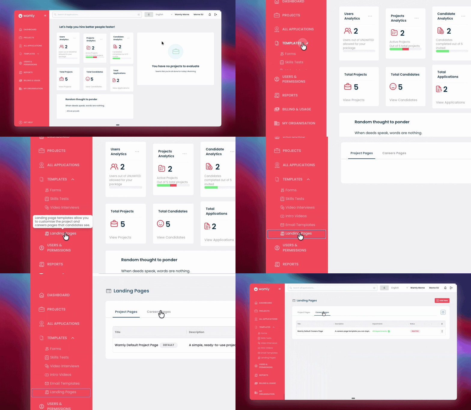
Careers Pages live inside the Landing Pages area of Wamly.
Log in to your Wamly organisation.
In the left-hand menu, click on Templates and go to Landing Pages.
You will see two tabs at the top of the screen: Project Pages and Careers Pages. Click on Careers Pages.
On the Careers Pages tab, you will see a list (if this is your first page, the Wamly Default Careers Page will be the only item) with these columns:
Title — the name you gave the page.
Description — a short note about the page.
Departments — which departments the page is linked to.
Status — either ACTIVE or INACTIVE.
Active pages also show two small icons:
opens the live page in a new browser tab
copies the page's link so you can paste it somewhere else, like an email or your company website.
4. Creating a New Careers Page
On the Careers Pages tab, click the red + Add New button in the top-right corner.
A form called Create New Careers Page will open. Fill in:
Template Name (required) — an internal name for the page, just for your team to recognise it. Candidates never see this.
Custom Careers Page Slug (required) — this is the unique part of the web link for your page.
Associated Departments — leave this as "All departments" unless you only want specific departments' jobs to show on this page. If you use this to build separate brand-specific pages, this is where you'd scope each page to the right department(s).
Template Description (optional) — a short note about the page, for your own team's reference.
Under Careers Page Layout, choose a starting design. You will see a gallery of layouts, including Wamly's built-in Wamly Default Careers Page, which already has a sensible layout, and you can just replace the words, logo, and pictures.
Hover over a layout card to see two buttons: Select (
) and Preview (
). Click Preview first if you want to see the design before choosing it. Click Select to choose it.
Once selected, the layout card shows Edit (
) and Preview (
) buttons, plus a “Reset Selection” button underneath if you want to start over and pick a different layout.
- Click Edit now to jump straight into the Landing Page Builder and start designing your page. Section 5 gives you a full tour of the builder; come back here once you're ready to save.
When you're ready, click the red Create button in the top right corner of the settings screen. You'll see a message like "Success! [name] created."
5. A Tour of the Basic Builder
You'll usually first meet the Landing Page Builder straight from the creation flow above (section 4). Later on, to get back into it for an existing page: find the page in the Careers Pages list, open its options menu (three dots), and click Edit.
5.1 The Layout of the Screen
The builder has three main areas:
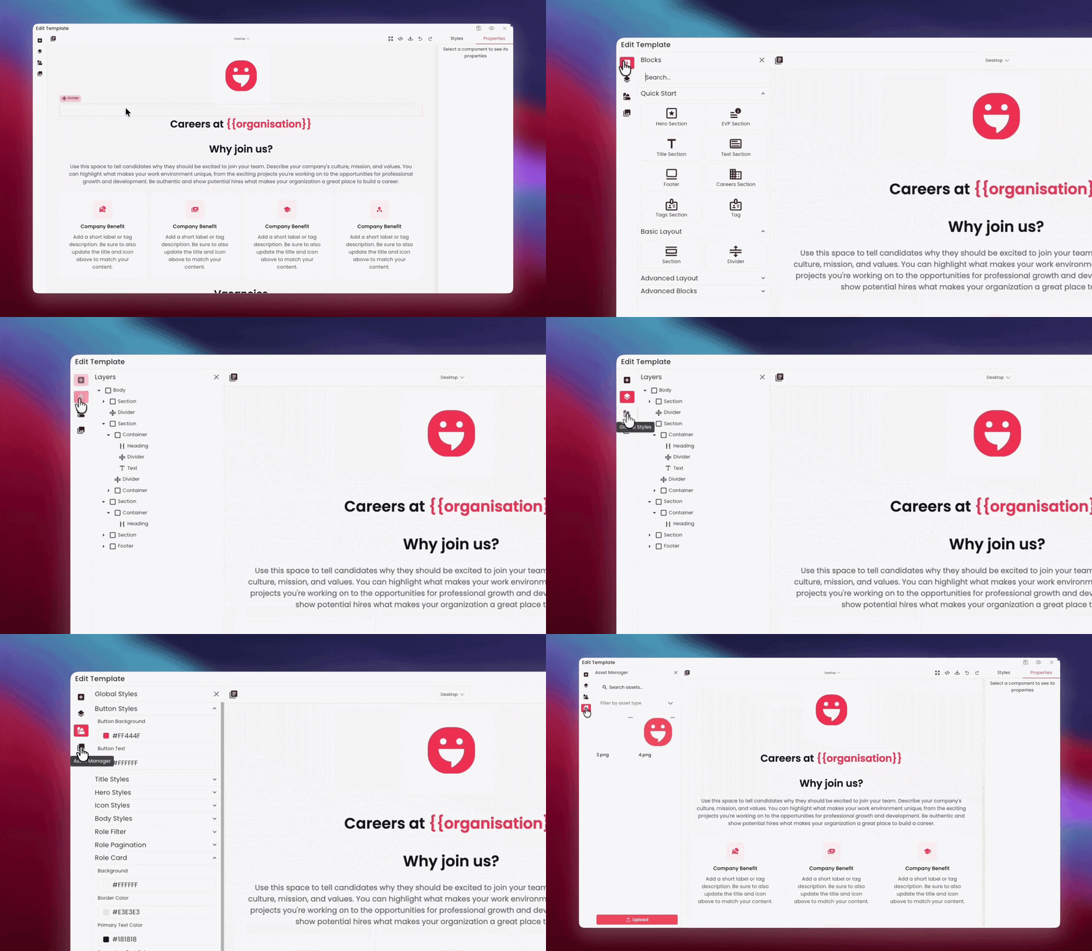
Left: a narrow strip of icons that open different panels of content you can add to the page.
Middle: the canvas — a live preview of your page. This is where you click on things to select and edit them.
Right: settings for whatever you have currently selected on the canvas. If you are using the Advanced Builder, the Styles tab will also be available in the right panel.
5.2 The Left-Hand Panels
Click an icon on the left strip to open its panel. Only one panel is open at a time.
Blocks (
) — the building blocks you drag onto your page, such as headings, text, images, and Wamly’s pre-built sections.
Layers (
) — a list of all the blocks on your canvas, from top to bottom, like a table of contents for the page itself. Useful for selecting something that's hard to click directly on the canvas.
Global Styles (
) — page-wide colour and font settings, such as your button colour or background colour. Changing something here changes it everywhere it's used on the page.
Asset Manager (
) — where your uploaded logos, photos, and videos live, ready to drag or insert onto the page.
Above the canvas, there's also a templates icon (). Clicking it opens a window called “Choose a template as a starting point” — a gallery of your organisation's saved Careers Page layouts. Selecting one swaps out everything currently on your canvas for that template.
5.3 What You Won't See: the Styles Tab
When you click on something on your page, a panel opens on the right with settings for that item. In the full (Advanced) Builder, this panel has two tabs: Styles and Properties.
Properties — the settings you can use, such as changing text, swapping an image, or choosing a heading size.
Styles — granular, per-element CSS design controls like custom colours, spacing, and borders on that one specific item. This tab is not available in the Basic Builder.
5.4 Switching Between Desktop, Tablet, and Mobile Views
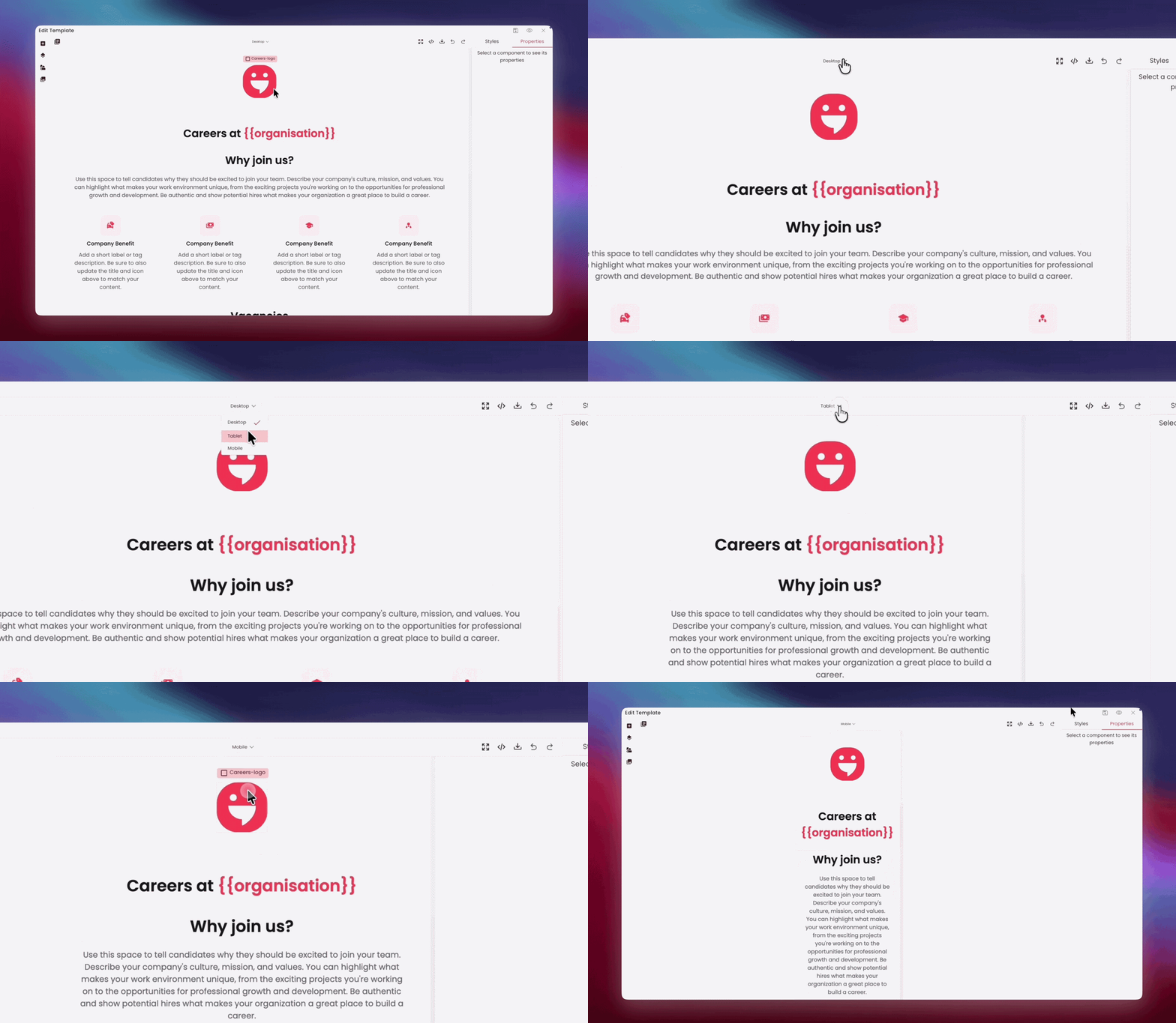
At the top centre of the builder, a dropdown lets you switch between Desktop, Tablet, and Mobile views. You can change views at any point while you're editing.
Edits are inherited downward: changes you make in Desktop view automatically carry through to Tablet and Mobile.
Making a change that only applies to one specific view (for example, a Mobile-only tweak) is only possible in the Advanced Builder.
6. Building Your Page, Section by Section
6.1 What You Can Add: The Blocks Panel
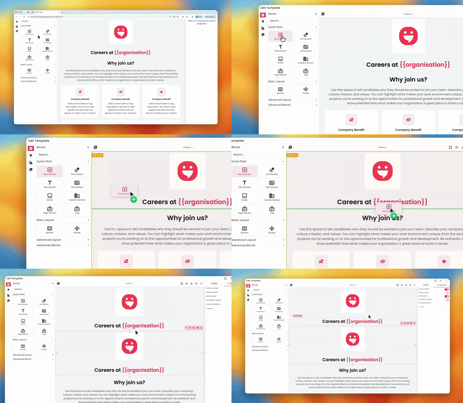
Click the Blocks icon () on the left toolbar to open the panel you'll drag content from. It's organised into categories:
Quick Start — ready-made careers page sections: Hero Section, EVP Section, Title Section, Text Section, Footer, Careers Section, Tags Section, and Tag. These make up the default template and are covered one-by-one below. This is the fastest way to build a page.
Basic Layout — Section and Divider, the simple building blocks used to group and space out content.
Advanced Blocks — despite the name, these ARE available to you on the Basic Builder: individual elements like Heading, Text, Link, Button, Image, Video Link, Video Asset, Map, and Icon.
Drag a block from the left panel and drop it onto the canvas. You cannot add a block by clicking it — it must be dragged. While dragging, a coloured line shows exactly where it will land.
6.2 Wamly default blocks
If you started from the Wamly Default Careers Page template, most of the work is already done for you. The page comes with six ready-made sections, in this order:
Hero
"Why Join Us"
Benefit Tags
a "Vacancies" title
the live Jobs list; and
a Footer
Every Careers Page footer shows a "Powered by Wamly" line with the Wamly logo. This cannot be removed or customised.
6.2.1 Hero Section (top banner)
This is the first thing candidates see. It shows your company logo in a white card, above a heading that reads "Careers at [Your Company]" — Wamly fills in your company name automatically based on your Organisation name in the app.
Click the heading text twice (double-click) to highlight and edit it, if you want to change the wording.
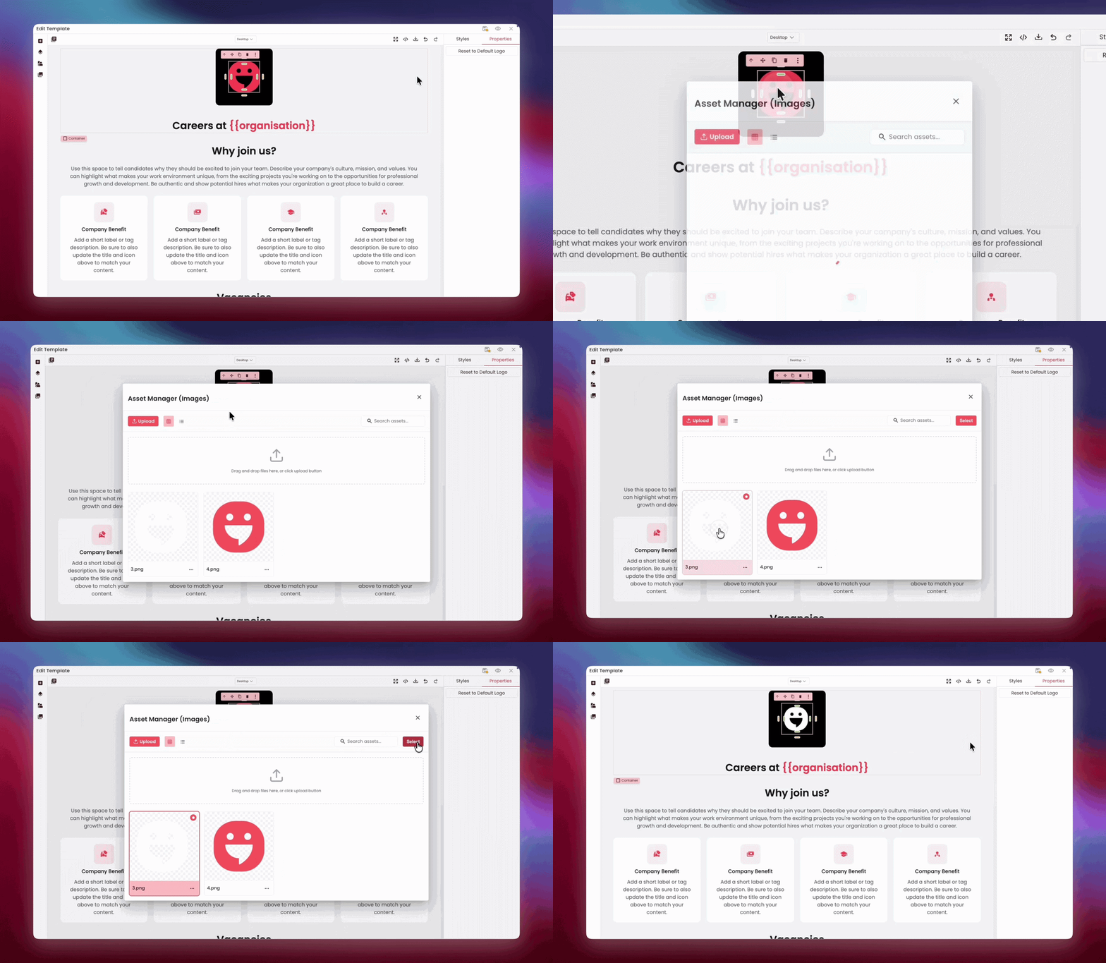
Double-click the logo to open the image picker and upload or select your own logo. If you ever want to go back to your organisation's default logo, use the "Reset to Default Logo" option.
6.2.2 EVP Section ("Why Join Us")
EVP stands for "Employee Value Proposition" — in plain words, this is your pitch for why someone should want to work at your company.
Double-click the placeholder text and replace it with your own message. Talk about your culture, your mission, and what makes your workplace special. Keep it warm and honest — this is often the first real impression a candidate gets of your company.
6.2.3 Benefit Tags (the small cards)
This section shows a row of small cards, each highlighting one benefit or perk. The default page comes with four cards, each with an icon and a short line of text.
Double-click a card's icon to open the icon picker and choose a different symbol from Wamly's icon library.
Double-click the card's heading and text to replace the placeholder wording with your own benefit, for example "Hybrid Work" with a short one-line description.
Repeat for each of the four cards.
6.2.4 "Vacancies" Title
This is a simple heading that introduces the jobs list below it. You can leave it as "Vacancies", or double-click it to rename it to something like "Open Roles" or "Current Opportunities".
6.2.5 Careers Section (list of live jobs)
This is the most important part of the page — and the good news is you don't have to build it. All your active, published projects will be displayed here automatically as jobs, in the format below.
Each job shown here pulls its details from the matching project in Wamly: role title, location, work type (like Hybrid or Remote), job type, salary range, experience level, job function, and closing date, plus an “Apply Now” button.
The short description under each job comes from the Role Summary field you fill in when setting up that project in Wamly — not from anything you type here in the Careers Page template.
Candidates can search, filter (by location, work type, job type, job function, and experience level), and sort the list themselves.
This section is locked in the builder — you cannot add, remove, move, resize, or restyle individual parts of it beyond what Global Styles controls.
This is intentional: it guarantees the filters, search, and sorting always match your real, live project data. You can still move the whole Careers Section up or down the page, or delete it entirely if you truly don't want a jobs list on this page.
7. Editing Text, Images, and Icons
If you make a mistake while editing the page or specific content, use the Undo button in the top toolbar (or press Ctrl+Z, or Cmd+Z on a Mac) to step backwards through your recent changes. Use Redo (Ctrl+Shift+Z, or Cmd+Shift+Z on a Mac) to step forward again.
7.1 Editing Text
Double-click any heading or text on the canvas to start typing directly into it.
While editing, a small toolbar appears on the screen with Bold, Italic, Underline, Strikethrough, text colour, background colour, and a "…" menu with alignment and "Insert/edit link" options.
Click anywhere else on the page to finish editing.
7.2 Replacing Images and Icons
Double-click any image to open the Asset Manager picker. From here you can either choose an image you've already uploaded, or click Upload and drag a new file in (or click the upload button).
Selecting the image you would like to replace the current image.
Double-click any icon (for example, on a benefit card) to open the Select Icon picker. You can search by keyword, and choose from a very large library of icons.
8. Saving and Previewing Your Page
Look for the Auto-save changes toggle in the top header of the builder. It is OFF by default.
If Auto-save is off, click the Save icon whenever you want to keep your changes.
Before sharing your page with anyone, preview it to see exactly what a candidate would see. You can preview from the layout card in the page list, or from the page's options menu.
9. Sharing Your Careers Page Link
From the Careers Pages list, click the link icon (
) on your page's row to copy its web address.
Paste this link anywhere you like: your company website's "Careers" button, a LinkedIn post, an email signature, or a job advert.
Use the open-in-new icon (
) to quickly open the live page yourself and double-check everything looks right before sharing it further.
10. Common Mistakes & Pro Tips
10.1 Common Mistakes & How to Fix (or Avoid) Them
Forgetting to save
Why it happens: Auto-save is OFF by default, so it's easy to build for a while, close the tab, and lose everything since your last save.
How to avoid it: Either switch Auto-save on at the start of every editing session, or build the habit of clicking the Save () icon every few minutes and again before closing the builder.
Writing long benefit card text
Why it happens: it's tempting to explain a benefit fully, but the cards are small and meant to be scanned quickly.
How to fix it: keep each card to one short sentence, and move any longer explanation into the "Why Join Us" section instead.
Leaving placeholder text or images in place
Why it happens: the default template looks polished even with placeholder content, so it's easy to publish before replacing everything.
How to fix it: before activating a page, walk through every section (Hero, Why Join Us, Benefit Tags) and double-click each piece of text and each image to confirm it's your real content, not the sample copy.
Trying to click a block into place
Why it happens: clicking alone can't tell Wamly where a block should land on the page — above the Hero, between two sections, or (by accident) below the Footer. Dragging with the visible insertion line makes the intended position unambiguous, so nothing ends up in the wrong place.
How to fix it: click and hold on the block in the left panel, drag it onto the canvas, and release it where the coloured insertion line shows it will land.
Expecting to edit the jobs list directly
Why it happens: the Careers Section looks like ordinary content, so it's natural to try double-clicking a role card to change its wording. The jobs list is locked so it always matches your real, live projects. If individual cards could be freely edited or deleted here, the list could drift out of sync with what's actually true, or break the search and filter functions candidates rely on.
How to fix it: remember the whole jobs list is generated automatically from your projects. To change what appears on a role card, edit the project itself (particularly its Role Summary field) — never the Careers Page.
10.2 Pro Tips for Success
Gather your brand assets first
Before you open the builder, collect your logo (PNG with a transparent background if possible), your brand's hex colour codes, and any high-quality team or office photos. Having these ready means you can build the whole page in one sitting instead of stopping and starting.
Preview before you activate
Use the Preview option (from the layout card or the page's options menu) to see the page exactly as a candidate would. Catching an awkward heading or a missing image in Preview is much better than a candidate catching it first.
Match your "Why Join Us" text to your real culture
This is often a candidate's first real impression of your company. Avoid generic corporate language — talk about what's actually true and specific about working there.
Use one Careers Page per brand, if you manage more than one
Each Careers Page has its own logo, images, and Global Styles theme. If your organisation runs multiple brands, this means you can give each one a distinct look without any of them clashing.